Architectural Photography: People or No People?
A fundamental question for architectural photographers: To what extent should they include people in their photographic interpretations of architecture and design - people or no people?
This is by no means a new question. It’s been the subject of discussion and consideration among photographers and the consumers, users and publishers of architectural photography for decades.
In “Building with Light, The International History of Architectural Photography”, author Robert Elwall, in his discussion of the work of Dutch photographer Johan Van Der Keuken, writes that architect Herman Hertzberger “criticized conventional architectural photography for being ‘cut off from life and unpeopled’”.
Hertzberger, in the words of Elwall, “pleaded for photography to concentrate on the ‘habitable space between things…to where ordinary day to day lives are lead…’”. Elwall goes on to say that this “new sensibility” is “well seen” in Van Der Keuken’s work, which spanned four decades until his death in 2001.
In his discussion of the work of architectural photographer Julius Shulman, Elwall states that “a notable feature of Shulman’s photography is his inclusion of people, suggesting that Modernist architecture, despite its rigor, is desirable and accessible”. To that extent both Van Der Keuken in Europe, and Shulman in the U.S., may have been early adopters of this new and emerging sensibility.
Given my own experience, I believe this trend has continued to evolve and now borders on obsession among architects and designers. Clearly it has become fashionable to load up an architectural image with the users of the architecture - or in most cases, models acting as proxies for the users - even at the risk of distracting from the design. I have a client, who shall remain nameless, who is more or less convinced that I am reluctant to include people in my images. This client hires me only for select projects where my predispositions toward image purity are not an issue. My wife, Kathi, will also tell you that while traveling and photographing architecture, I often wait until people clear the scene before tripping the shutter.
Don’t get me wrong, this trend to the inclusion of people and activity in architectural photography is generally a move in the right direction. However, I frequently find it being over done - to the point where carefully choreographed human activity, of the sort usually dictated by clients, often upstages the architecture itself. I also find it curious that while the inclusion of people in architectural images is now almost universally considered desirable, the clutter that usually accompanies human activity is almost without exception wiped clean from those images. The exceptions to this rule can be found in the work of Gabriele Basilico and Robert Polidori - two of my heroes.
In previous posts, I have spoken frequently about the influence of architectural photographers Balthazar Korab and Ezra Stoller on my own work. I have long been a student of their work, and I find that much of it - to the extent they had control of a site - was composed and shot without the inclusion of people. Their focus was clearly and solely on the architecture. When they did include people in their images, it was done in a way that lent scale and humanity to their work, but did not dominate their representation of the design. Shulman got it right in this way, also.
I am firmly in this camp, and I do believe in showing scale and humanity in architectural images, particularly when done well and not competing with the architecture. However, it need not be done so literally. Scale figures used sparingly, and/or evidence of their presence can go the distance without unduly diluting the imagery. After all, architectural photography of its essence is about architecture, and the architecture in my view, should be the dominant theme.
Following in no certain order, are a variety of images that illustrate my own sensibilities and predispositions in this regard. The range illustrated below varies from subtle, to moderate, to heavily people populated images, including minimalist images without the inclusion of people at all.
Above: Olson Headquarters, Ford Center, Minneapolis, MN - Gensler.
I shot this image as part of a three-day, 14 hour per day, shoot for Gensler - the architect and interior designer of this space. Two of the project architects from Gensler’s Chicago office shadowed me during the entire shoot. I quickly learned that they were partial to more tightly framed views of their work, and very much predisposed towards the inclusion of people in their architectural representations. Prior to the award of this contract, they requested that I submit examples of my work showing how I handle people in an architectural setting. I’d just shot a series of candids at a three-day Search for Shelter workshop at UM-Rapson Hall, so I submitted the best of that shoot, and was promptly awarded the work.
This image has got to be one of my favorites. I like the silhouette of the figure entering the lobby space and the reflection of the figure in the glass wall opposite the entrance. There is a certain anonymity associated with a silhouette that works well here. This I’ll admit was carefully choreographed. In my view, it does not detract from the representation of the space - it’s transparency and reflectivity - but actually enhances it.
View this image larger at: https://www.flickr.com/photos/peterjsieger/7474307324/in/set-72157630359220208
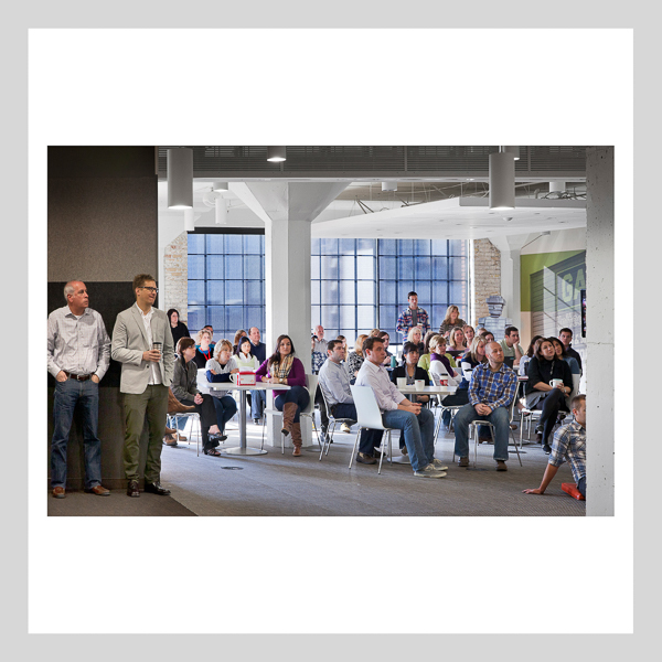
Above: Olson Headquarters, Minneapolis, MN - Gensler.
This is a view of the commons area at Olson during a company-wide debriefing session. It is literally loaded with people. I very much like this assembly of users, but it literally dominates the representation of the space itself.
View this image larger at: https://www.flickr.com/photos/peterjsieger/7474238380/in/set-72157630359220208
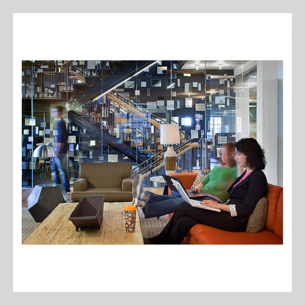
Above: Olson Headquarters, Minneapolis, MN - Gensler.
This is a view of the nineth floor waiting area. It too was carefully choreographed. It aptly represents both the use of the space, and the spatial qualities of the interior architecture. However, this image also characterizes one of the issues I have with the way people are represented commonly by architectural photographers as of late. The use of the blurred figure, as shown here (on the left), is in my view, completely over-used, and cliched.
View this image larger at: https://www.flickr.com/photos/peterjsieger/7474289886/in/set-72157630359220208
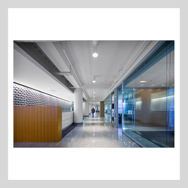
Above: Parameters Showroom, Minneapolis, MN - Gensler.
I shot this image while doing a short film with fellow photographers and collaborators affiliated with IDE[A] - Imaging the Designed Environment [Architecture]. We had more or less complete control of the space, so I opted to take a minimalist approach with my images, which focus mostly on the interior architecture, rather than the users of the space. This image places a small scaled figure (fellow photographer Marc Ofsthun) in the background, just for a simple touch of humanity.
View this image larger at: https://www.flickr.com/photos/peterjsieger/6007406194/in/set-72157627227541057
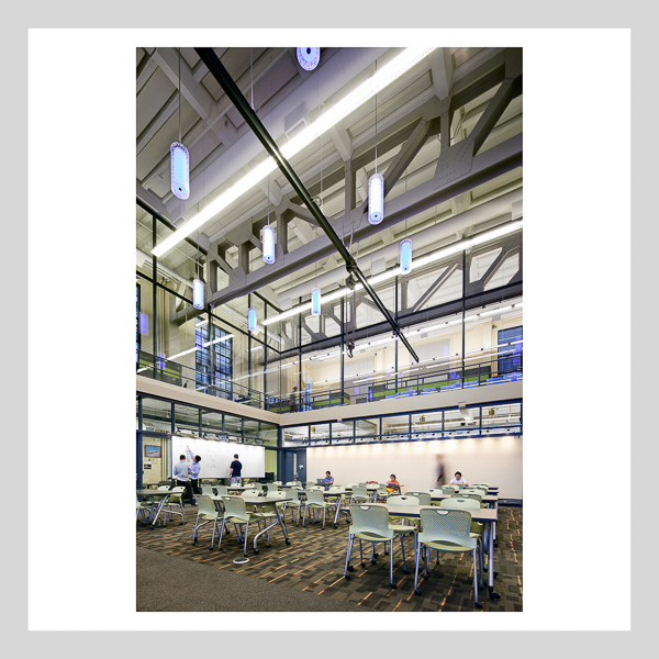
Above: University of Minnesota, Akerman Hall Renovation, Minneapolis, MN - BWBR
I shot this image for the July/August 2012 Cover of Architecture Minnesota magazine. It is moderately people populated, and as choreographed, contains an understated sense of scale and humanity. In this case, the user activity does not dominate the space. However, I hesitate to go farther than this with activity in my images, risking visual chaos and miss-placed emphasis.
View this image larger at: https://www.flickr.com/photos/peterjsieger/7248940434/in/set-72157629846912148
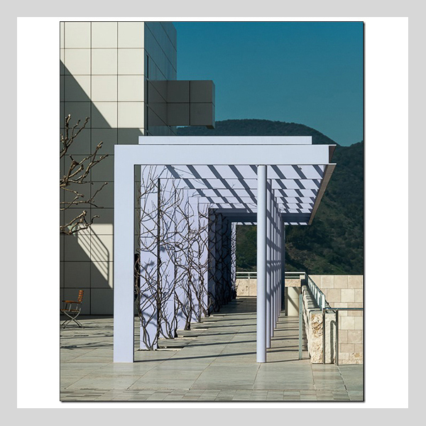
Above: The Getty Center, Los Angeles, CA - Richard Meier & Partners.
This is fine art, as distinguished from the rest of the architectural photography in this post. It was executed, though, with the sensibilities associated with architectural photographers. The perspective is deftly handled, as are the light and the composition. This image - “Getty Purple” - was composed, shot and rendered by friend and fellow photographer Michael Day McNamara. Note the placement of the chair near the left edge of the image. This is a great example of the subtle and refined introduction of scale and humanity in an image, without the overt use of people in the scene - exceptionally well done!
See more of Michael’s work here: http://www.mdmphotostudio.com
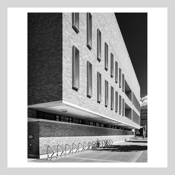
Above: Wilson Library, University of Minnesota, West-Bank Campus, Minneapolis, MN - Cerny Associates
This is one of my most recent images, part of a study of mid-century modern architecture at the UM West-Bank Campus. Note the understated scale figure in the background. That figure, together with the bikes and bike racks, constitutes a subtle statement of scale and humanity in this image - with little or no distraction from the architecture, at that.
View this image larger at: https://www.flickr.com/photos/peterjsieger/14830212823/
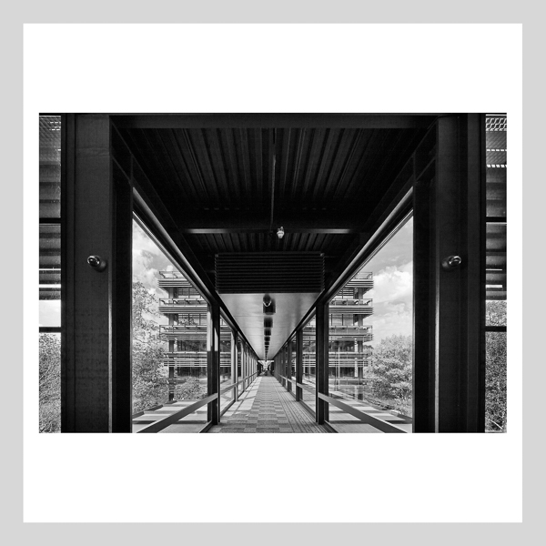
Above: John Deere & Company World Headquarters, Moline, IL - Eero Saarinen and Associates.
I shot this image on a recent trip to Moline with friend and fellow architect John Van Dyke. The two of us agree that this architecture ranks among Saarinen’s best. I selected this camera position and this composition, recalling that Ezra Stoller shot an iconic image from approximately this location. Having revisited Stoller’s image after making my own capture, I now realize that Stoller was a few steps behind my location when he made his image. In doing so, he captured more of the curtain wall and sun screen in the foreground, resulting in an image of considerably greater complexity and richness than my own. Otherwise the composition is comparable. Note that there are no people represented in my image, nor were there any in Stoller’s. The focus in both cases was purely on the architecture itself.
View this image larger at: https://www.flickr.com/photos/peterjsieger/14800873914/
I’m not altogether reluctant to include people in my images. The Olson images I shot for Gensler attest to that. However, I must admit that the Wilson Library and Deere images, above, represent my most basic inclinations towards austerity in architectural imagery. I’m a bit of a purist and perhaps a product of the old school when it comes to architectural image making - this again due to the influence of both Korab and Stoller - grateful for that! As far as I’m concerned, the architecture and the design must always be the dominant theme when undertaking meaningful architectural photography. To that extent, I’m a minimalist. In the immortal words of Mies van der Rohe, “Less is more”. And, I for one, am a firm believer.
Visit my Website here: http://siegerarchphoto.com
My Behance Portfolio can be seen here: https://www.behance.net/peterjsieger

