Architectural Photography: People or No People? (Revisited)
I’ve received some feedback on my recent post titled: “Architectural Photography: People or No People?” http://peterjsieger.svbtle.com/architectural-photography-people-or-no-people
Truth be told, the feedback exposes that post for what it is: a rather narrow, pointed, and thinly veiled effort to justify my predisposition to exclude, or at least minimize, the use of people in my architectural images.
In that post, I conveniently ignored the notions:
1.) That architecture is fundamentally for people;
2.) That people in an image say something about how a space is used; and,
3.) That people actually create vitality in a place, which might otherwise be lifeless without them.
All of these arguments, while completely valid, take me in a direction which is opposite my now deeply ingrained sensibilities. As I mentioned in the post, I have been studying architectural photographers Balthazar Korab and Ezra Stoller (among others) for years - decades actually - and their tendencies to purity in their architectural images have completely taken me.
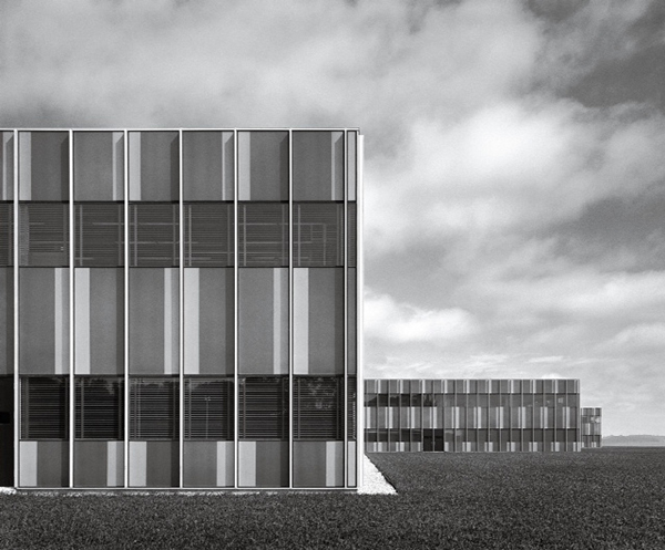
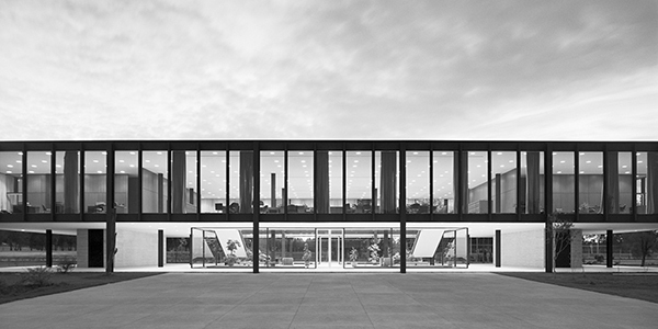
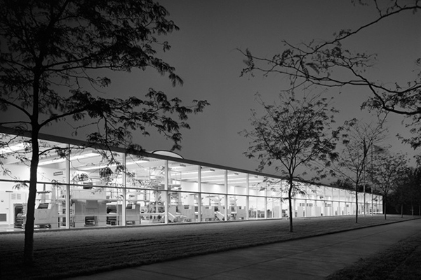
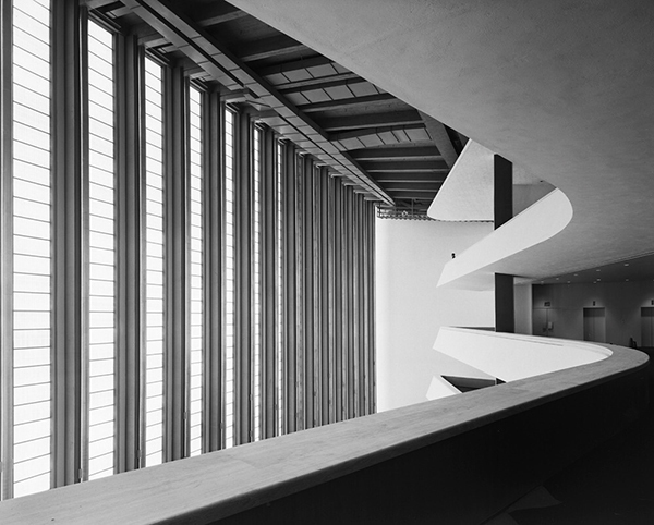
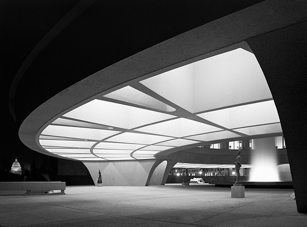
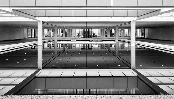
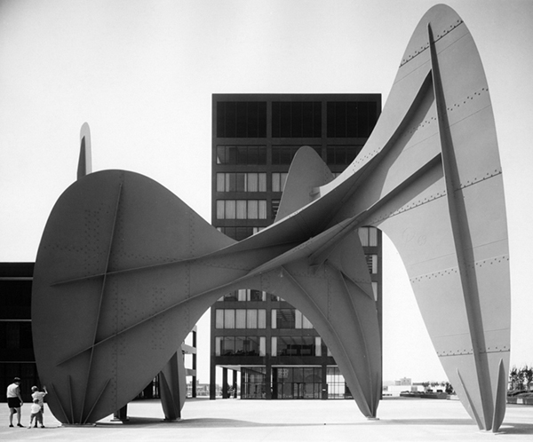
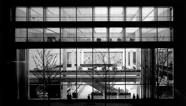
Here, for example, are three Korab images without people, followed by three Stoller images without people. These exude the kind of image purity that speaks solely to the architecture - the kind that underpins my own deep-set sensibilities.
The Korab images:
The Stoller images:
These are visually beautiful and evocative. Of course, I carefully selected each of these images, from what’s available on the internet, because they support my argument for minimalism and abstraction in architectural imaging. The black and white rendering actually enhances the abstract qualities of these images, much to my liking. The images were no doubt shot on black and white film, before architects and designers started demanding literal renderings in color.
Korab and Stoller did, of course, include people in their images. Following are examples, again carefully selected.
Korab:
Stoller:
Can you find the people in the Stoller image? The point, here, is that the people in these images do provide scale and a touch of humanity, but they do so without dominating the visual statement about the architecture.
In the end, the whole question is completely subjective, personal, and situational - both for the architect and the photographer. My own inclinations are more and more towards minimalism and abstraction in the interpretation of architectural subject matter. However, I find the demand among most architects and designers running contrary to these sensibilities, and more towards an intentionally literal interpretation of their work.
The bottom line, as far as I’m concerned, is that the use of people in an architectural image can either make or break the image, and must be treated with utmost care and deliberation - erring on the side of subtlety and understatement, so design intentions are clear, and there are no questions of emphasis.
For more on Architectural Photographer Balthazar Korab, see:
http://www.balthazarkorab.com/01_biography.html
For more on Architectural Photographer Ezra Stoller, See:
http://ezrastoller.com/biography
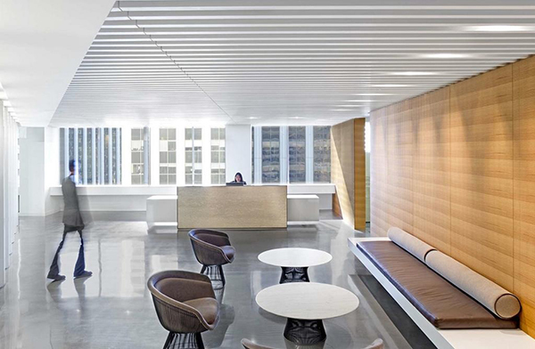
P.S. I found the following image in a Twitter post by Architizer Magazine. Architizer gave no photographic credit, nor do they ever, much to my ongoing dismay.
This is a perfect example of what has become fashionable in architectural photography - i.e. the use (or shall I say the miss-use) of the blurred figure. This, in my opinion, epitomizes Webster’s definition of the word “trite” - something “lacking in freshness or effectiveness because of constant use or excessive repetition”. This deformation of the human figure dominates what might otherwise be a fine architectural representation of the space. How in the world did this image find its way through the post-production process? I have no issue with the figure behind the desk.
Visit my Website here: http://siegerarchphoto.com
My Behance Portfolio can be seen here: https://www.behance.net/peterjsieger
