Architectural Photography: Case Study - Minneapolis Loft
It’s been months since my last post with thoughts on architectural photographer Gabriele Basilico. I’ve been happily preoccupied shooting and post-processing both client work and a number of self-directed projects, some of which will likely show up in future blog posts.
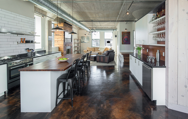
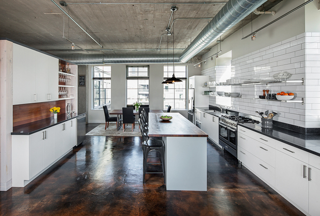
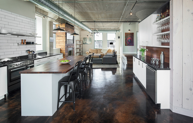
This post takes a look at a Minneapolis North Loop Loft project shot in February 2015 for one of my clients, Albertsson Hansen Architecture (AHA) - < http://www.aharchitecture.com >. Following is a view through the kitchen/dining area towards the living room.
This project, like most, presented its own set of challenges - some unique, and some that are a part of virtually every interior project undertaken. The charge here was to come away with a half-dozen or so images that captured the essence of this residential loft conversion from former industrial space.
The big challenge here, as with most residential projects, was the lighting. I’ve found that most residential interiors are shot at the homeowner’s convenience. This places most interior photo shoots somewhere between the hours of 9:00 AM and 5:00 PM - “banker’s hours” - where the lighting can be extremely contrasty, especially when the sun shines. Under these circumstances there is always a significant difference in lighting levels inside and out, making it very difficult to capture sufficient detail in both the highlights and the shadows in any scene - without “blowing out” the windows - regardless of whether shooting with film or digitally.
As with most residential lighting schemes, incandescent lighting of various types, both built-in and portable, comprised the lighting within this space. However, given the shoot time and sunny conditions, daylight completely dominated. To mitigate the contrasty lighting conditions found here, I used a 750 watt/second Bowens Monolight, fitted with an umbrella diffuser, to add soft foreground fill lighting where necessary.
Relatively tight working conditions, as with most residential interiors, presented the other big challenge here. This, together with Albertsson Hansen’s predisposition towards expansive spatial views, orthogonally framed, dictated the use of a wide angle tilt-shift lens.
In this case, I used only my super-wide 17mm Canon tilt-shift lens, even though I’ve found that longer lenses can produce a pleasing compression of perspective when working space is sufficient. Under these circumstances, the “17” was indispensable for managing perspective and composition, and also for capturing an orthogonally framed panoramic view of the kitchen, even with very little working room.
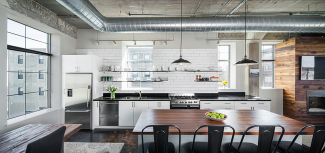
Following is the panoramic kitchen view.
View this image larger at: https://www.flickr.com/photos/peterjsieger/16625972868/in/album-72157650889654947/lightbox/
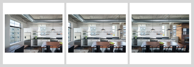
Note that this image consists of three separate captures - one with the lens centered, and two others with the lens shifted left and then right, as follows.
These three separate images where stitched together seamlessly in Photoshop to create the panorama. I “popped” the strobe, aimed separately, for each capture, and in post-production, Photoshop blended the fill lighting seamlessly.
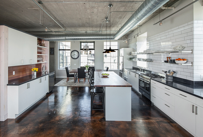
The other challenges in this project presented themselves during post-production. Turns out my client was unhappy with the clock and the dining room light fixture in the following image, as shot in the kitchen/dining area.
At my client’s request, I removed them with post-production edits in Photoshop, as follows.
View this image larger at: https://www.flickr.com/photos/peterjsieger/16813524835/in/album-72157650889654947/lightbox/
There are a number of ways to achieve this result. In this case, I used the cloning tool and the healing brush on a copy of the image, preserving the original file. An alternative for complex edits would be to select the area to be edited, paste it in place, and make the edits on this separate layer, which could then be switched on or off to show or hide the edits.
The other conundrum that revealed itself in post production was the position of the living room easy chair, as shown in the first image above, and repeated here, as follows.
My client felt that the chair as found in the space, and represented here, attracted an inordinate amount of attention, and actually created a visual distraction. So, rather than re-shooting this view, we arrived at a compromise, which was to rotate the chair and the ottoman in the image so that they both sat parallel with the rest of the living room furniture, and would be seen in profile only, as follows.
View this image larger at: https://www.flickr.com/photos/peterjsieger/16606234807/in/album-72157650889654947/lightbox/
In this case, I made separate copies of the chair and the ottoman, rotated them using “perspective warp” in Photoshop under the edit menu, scaled them to suit, and inserted them into a copy of the image, while preserving the original file. There were some further retouches necessary to blend the modified chair and ottoman into the original view, and of course, the shadow of the chair and the ottoman needed to be modified slightly to represent their new positions.
I don’t like doing this. I’d much rather represent a scene as found with perhaps the necessary “styling” on location to suit the client. However, I can make these sorts of image manipulations, and I have under certain circumstances, usually at extra cost. AND - I’d note further that “the customer is always right”, so end of discussion! …just “another day at the office”.
Visit my Website here: http://siegerarchphoto.com
My Behance Portfolio can be seen here: https://www.behance.net/peterjsieger
