Architectural Photography: More on Black & White
In recent posts, I’ve outlined my thoughts on the application of black & white imagery in architectural photography. I suggested that black & white images, though seldom considered for publication or interpretive purposes, can be especially useful as abstractions, depicting in a superior way, the architectural design essentials of light, form, structure, space, texture, and repetition.
Following are some additional thoughts, and some case studies drawing from diverse building types, which illustrate the conundrum - black & white vs. color in architectural imagery.
A Clear Case for Black & White:
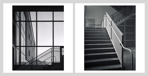
I shot the following two images several years ago at a view camera workshop that I conducted at the University of Minnesota College of Design. The images, flatbed scans from 4" x 5" Kodak 100 T-MAX, represent two views of the stair from the lobby to the lower level in Rapson Hall. The architecture by Steven Holl with VJAA is minimalist, a perfect opportunity for abstract expression.
There’s little doubt in my mind that a black & white rendering is appropriate here, as color in the scene is muted, and not a central design element. Both images are abstractions describing the stair detailing in the context of its immediate surroundings. A color rendering, though a more literal representation, would have added little of importance.
A Clear Case for Color:
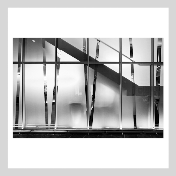
The following direct digital image represents a glass wall separating the entrance and elevator lobbies at Walsh Bishop’s St. Croix Casino in Danbury, Wisconsin. It’s an abstraction that works well in black & white.
However, the following sequence of the same image in color begs the use of a color rendering.
In this case, the lighting was cycling continuously through a sequence of three different colors. Three separate captures in color say much more about the quality of the lighting, which is a critical component of the interior design.
The Conundrum: Black & White or Color?
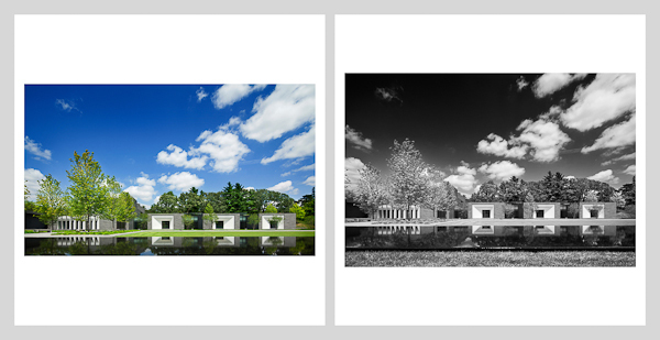
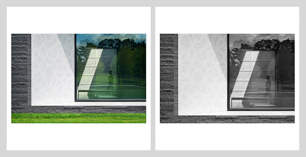
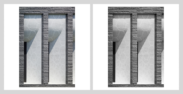
Following is a sequence of direct digital images shot at HGA’s award winning Lakewood Garden Mausoleum. The images, shot with tilt-shift lenses of various focal lengths, represent a variety of views from wide through detail. The choice here between color and black & white, will vary from scene to scene, and will depend more on emotional judgements.
For this wide view, conventional wisdom would suggest the more literal colored rendering. In my view, however, this could go either way - a question of emotional preference. The same could be said for the following more tightly framed view of a single crypt.
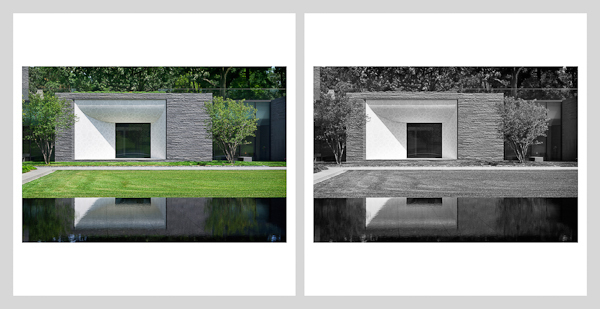
The more detailed views that follow are abstractions, that might well go black & white.
There is really very little difference in the color (or lack thereof) in the final pair of images. The question in this case has more to do with the apparent warmth of the image - again an emotional call.
This, of course, is all very subjective. Generally I believe that wide and contextual views can stand to be more literal representations of the subject, while tighter, more detailed views led themselves to less literal abstractions in black and white. Regardless, I believe that the selective use of both color and black & white imagery should be considered when planning and executing architectural photography. The approach should be deliberate, carefully considering the story to be told. Overlooking the attributes of well executed black and white architectural imagery could well constitute a pure and simple case of missed opportunity.
For more on the Lakewood Garden Mausoleum, see:
http://www.flickr.com/photos/peterjsieger/sets/72157630356995274/
http://www.flickr.com/photos/peterjsieger/sets/72157632818089176/
http://www.flickr.com/photos/peterjsieger/sets/72157632818237554/
http://www.flickr.com/photos/peterjsieger/sets/72157636443608103/
My Website can be found here: http://siegerarchphoto.com
