Architectural Photography: Black & White - Another Way of Seeing Things?
Most of my architectural photography in recent years has been done in color by direct digital capture. I’d attribute this to almost universal demand in the marketplace, dating first to the time when color film came to use, and reinforced more recently when digital capture all but replaced film.
Most architects and designers have a preference for the literal representation and interpretation of their work in photography. Most architectural magazines - even the electronic web versions - would appear to be a part of this consensus, if only because architects and designers provide much of the visual content.
Nonetheless, I maintain a strong personal attachment to black & white imagery of the sort Balthazar Korab and Ezra Stoller - two architectural photographers of vastly different sensibilities - produced with large format cameras at the heights of their exceptional careers.
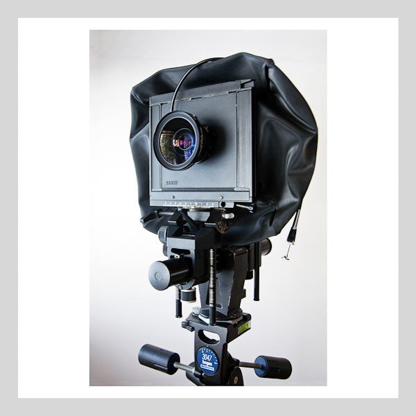
Though I’m now using a DSLR - A Canon 5D Mark II and Canon’s complete line of tilt-shift, perspective control lenses - I also have a strong attachment to the large format view camera as the preeminent tool for the production of architectural photography, given the creative controls available to the photographer. I lament the fact that my own 4" x 5" view camera, a Sinar F-1 seen here, has remained parked in its case for the past 15 months.
The irony that I photographed and rendered this largely black camera in color does not escape me.
To my way of the thinking, the beauty of black & white photography is that it is timeless, and indeed less literal, lending itself to abstract expression. In fact, I am convinced that a well executed black & white image has the unparalleled ability to reduce an architectural subject to its design essentials - light, form, structure, space, texture, repetition.
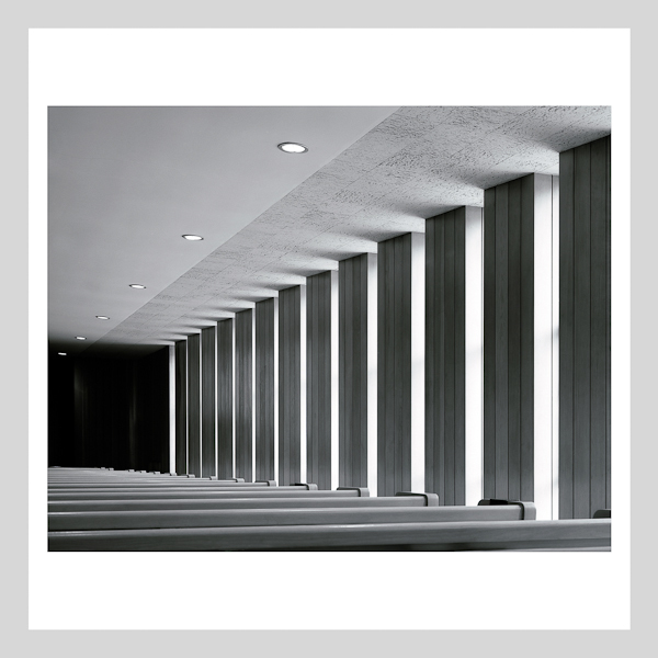
Certainly it can be argued that color is a design fundamental, and should be represented accurately with the rest of the essentials. However, when color is of little consequence in a scene, a color rendering may not be the best approach. This view of the side aisle in Eliel Saarinen’s Christ Church Lutheran is a good example of when to go black & white.
This image is a flatbed scan from 4" x 5" Kodak 100 T-MAX, shot on my Sinar F-1 with a 215mm lens to flatten the perspective.
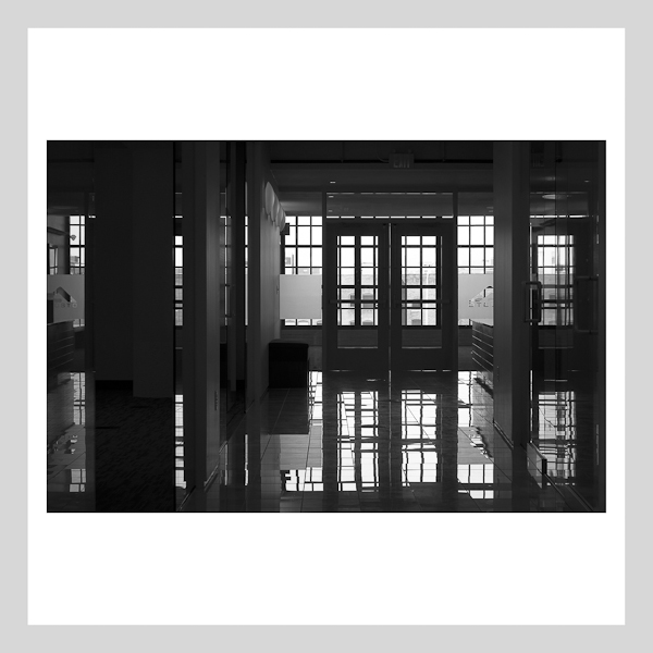
The following direct digital image is a view of the reception area in Agosto’s new headquarters by Collage Architects. This image was shot on my Canon 5D Mark II with a 90mm tilt-shift lens to flatten the perspective. The extreme contrast in this scene, well beyond the dynamic range capture capabilities of both film and digital, lent itself nicely to an abstraction highlighting (or shall I say low lighting) the spatial qualities.
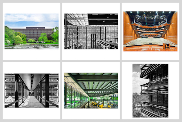
In both images I believe the abstractions are optimized through the use of a black & white rendering. I’ve observed and am fully convinced that a selection of black & white and colored images, when viewed together, can be visually rich, as illustrated in this composite representing Eero Saarinen’s John Deere and Company World Headquarters in Moline, Illinois.
Selective use of both color and black & white images - together - just may be worth some serious consideration when conceiving the next photo shoot - a proposition that is no less applicable with digital capture.
For more on the John Deere and Company World Headquarters, see:
http://www.flickr.com/photos/peterjsieger/sets/72157637824861774/
For more on Architectural Photographer Balthazar Korab, see:
http://www.balthazarkorab.com/01_biography.html
For more on Architectural Photographer Ezra Stoller, See:
http://ezrastoller.com/biography
My Website can be found here: http://siegerarchphoto.com


